
My Roles & Responsibilities
User Research & Analysis, User Flow, Information Architecture, Wireframing, Documentation, Knowledge transfer for the visual approach to UI designer, Coordinating with Developers
Context
Client Project at Divami Design Labs (July 20202 - Sept 2020)
Team: Me, Sarath (Senior UX Designers) + Aparna (UI Designer)
Tools
Sketch, Balsamiq. Google Docs
ℹ️ About Golftripz
Golftripz is an online platform that lets you book golf tee times and golf holiday packages at golf courses all over the world.
🤔 The Problem
When the usability of a website isn’t smooth and intuitive, users tend to get frustrated and leave the website. This was the problem with the Golftripz website.
They were losing potential customers due to the confusing flow and the high number of clicks that were needed to get to the final booking stage.

🎯 The Goal

To make the site a smoother experience, less cluttered and confusing, prioritizing what information needs to be shown and reducing the effort needed to get to the final booking page.
To provide an engaging and interactive user experience so that the user doesn't leave the website in a hurry.
Interviews
Conducted interviews with the stakeholders of the company + Spoke to 5 different end-users to better understand the problem.
Stakeholder Interviews
-
What is the USP of Golftripz?
-
What is your marketing strategy?
-
Who do you think are your primary & secondary users (if applicable)?
-
Is your main focus only on India and the US audience or are you planning for any other locations?
-
Whom do you consider as your competitors?
-
Do you have any preference for the visual appeal of the website?
User Interviews
-
What type of golfer are you?
-
How do you like to commute inside the golf course?
-
What are the factors that influence you to plan a golf vacation?
-
Is the reputation of the golf course architect, a decision criteria for choosing a golf course?
-
How often do you plan golf holidays/vacations?
-
Outside of golf, which of the following elements do you consider the most when choosing a golf destination?
-
How do you generally book destination golf trips/vacations?
Interview Analysis
Grouped together similar findings to identify patterns and trends in the data, which enabled me to develop
key findings for improving the
user experience and content of the Golftripz website.


a snippet of the grouped data
Key Findings

It seems to be a male-dominated user base of age group: 40-60

Most users use :
Mobile for viewing the information and prices.
PC for entering details and booking.

Users found
search assistants
a huge plus point.

Surprisingly, we found that
users tend to book golf vacations based on the type of experiences - ex: cultural or nightlife, rather than the topography - ex: on the mountains or near the beach.

Users plan their vacations according to the seasons.

Other popular elements considered while booking a holiday:
-
Nearby attractions to the destination
-
Ease of access
Competitive Analysis
To stand out, it was crucial to analyze the competitors in the market, seeing what they had to offer and what we could do differently to elevate the experience.
Looked at 3 of the global competitors


Use Cases
Next, we worked on our use cases and user stories. Describing the type of user, what they want and why helped in simplifying and understanding the requirements.
It also helped combat the natural tendency to design for ourselves (or our stakeholders) rather than designing for our target audience.
Some use case examples are shown.

a few of the use cases
✍🏽 Wireframing
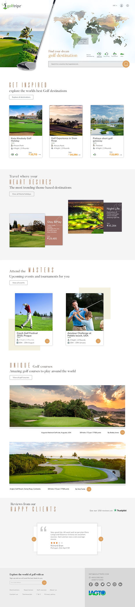
The Landing Page
Multiple Entry Points to High Priority Information
The current site offered the following bookings:
1. Golf Course booking
2. Golf Holiday Package booking
3. Golf Lessons booking
Most of the users came to the website to book Golf Holiday packages, so Golf Holidays were the top priority, so made sure that there were multiple entry points to the golf holidays page.

Adding Personalization
Played with content to add personalization. Ex: replaced 'Find Golf Holidays' with 'Find Your Dream Golf Destination' which engenders enthusiasm and engagement. Users can also mark destinations they have visited.
Making it Interactive
Went with a world map view on the landing page, adding an interactive experience where the user can easily explore all the destinations available.
Other Pages
Wireframed for desktop and then mobile.
🎨 Visual Design
I sat with the UI designer and discussed ideas on how we wanted the whole look and feel of the website to be like. The goal was to give it a clean, classy, and luxurious look considering the users are willing to spend money on the experiences. Showing captivating pictures throughout the website was essential.
old landing page

new landing page
Walkthrough of Main UX Changes

Engaging Landing Page
All the cities having holiday packages are shown upfront on the world map. This is for users who want to explore all options. This allows them to do so freely, in one place
While hovering over a city, a snippet of
information about the city is shown.
On clicking, they will be directly taken to the packages available at that destination. Therefore, they can explore all the destinations offered without having to perform any clicks at all!
Additionally, cities can be filtered through experiences (ref. to key insights):
-
nightlife
-
stay and play
-
inspiration
-
bucket list
Depending on the selection, the cities shown will change, adding a touch of personalization.
Search bar for users who already have a specific destination in mind and wouldn’t want to spend time looking around the map.
old menu
Personalized Menu
-
Instead of a drop-down menu (shown in the old website design) the menu now opens up by clicking the hamburger icon.
-
The menu opens up across the whole screen, giving enough information to be displayed without clutter.
-
To add to the experience, it has a conversational approach.
-
Experiences and events are added to the menu. As found in user research, golf lessons were a lower priority so it is merged into the Golf courses page.
.png)
new menu
.png)
Consolidated
Golf Holiday Listing Page
As Golf Holidays had a high priority, a specific page was created. All holiday packages available on the website are listed here and can be filtered.
When coming from a particular country page,
the name of that country or city will already be
auto-filled from the dropdown. This eliminated the need for multiple pages that were present on the old website.
Quick inquiry for holiday packages. This is useful as many times the user base doesn’t have time to wish to spend time reading all the details. They can enter their email address and a consultant will get back to them with the details of the package

Clean Country Page
Got rid of redundant information which was present in the old design. We included information that was only necessary.
For example, everyday weather at a country level isn’t required when already mentioned on the city page and the booking page. The whole country is unlikely to have the same weather.
Organized the content. Displayed KPIs of the country along with icons so that the user gets an overview of the country.
For easy access and to explore the cities in the specific country, went again for an interactive map style.
Again, included Holiday packages -
the main USP and what most users came for. Popular packages in the country are shown.
4.

4.
old page
new page
old page
new page

City Page
Enables quick navigation to other cities within the same country.
Users can directly navigate to the holiday packages in the city, without wasting time.

💭 Takeaways
-
Prioritization of information is really important, both from a user and a business point of view.
-
Learned to design for content, keeping SEO in mind.
-
Stakeholders can have valuable information regarding their users, details that we might not know. So it is important to ask for information from their side.
-
Figuring out the use cases plays a huge part before jumping into the design, ensuring that we don't miss any cases while designing.
-
It is not just great content, but it is also the presentation and an engaging UX that is key for getting users to stay longer on the page.