
My Roles & Responsibilities
User Research, Information Architecture, Ideation, Wireframing.Visual Design, Prototyping
Context
Class project under Prof. Jesus Garcia (Nov 2021 - Dec 2021)
Team: Me & Cassie
Tools
Figma, Miro
ℹ️ What is BART?
BART (Bay Area Rapid Transit) is a heavy-rail public transit system that connects the San Francisco Peninsula with communities in the East Bay and South Bay.

Secondary Research
Yelp, Google, and Apple Store reviews


Main Findings:
Before riding:
-
Lack of notice in delay
-
Inconsistency of the timetable with the actual departing time
On the train:
-
Lack of cleanliness
-
Loud people/noisy
-
Intercom voice not heard
-
Train delays
After riding:
-
Payment for parking is advertised wrong
Field Research
📍BART station and on the train
1.
2.
3.
4.
5.
6.
Visited the Civic Centre BART station at 10 am on a Sunday
Observed friend’s reaction as a first time BART user
Walked through the station, and observed and talked to different kinds of people at each point. Documented their interactions with photos and notes
Purchased a ticket as a first time user, and took a train till Embarcadero Station
Got down at the station and did some more observation and interviews to gain insights.
Rode back to the Civic Centre Station


A few people we interviewed:


.jpg)
👤 Creating Archetypes
After gathering insights from our research, we had an idea of who our target audience was.
We grouped them into three archetypes


Opportunities found:
1. Entering the Station (before entering the access gate)
-
Make the kiosk interface more intuitive to understand
-
Make the labeling of the kiosks easier to understand
-
Change the location of the clipper card scanner so that it's more visible
-
Integrating the card scanning process
-
Make information related to the journey/BART system - more accessible, especially near the kiosks - regarding phone wallets and BART app
2. Entering the Access Gate
-
Make the entering and exiting sign more obvious
-
Make the card scanning process for the accessible gate more aligned to the mental model
3. Going to the Platform
-
Make the elevator more accessible/easier to find
4. At the Platform
-
Color code the lines
-
Make information consistent across the platforms
-
Introduce markings on the platform for bike areas, entry areas etc
-
Show the direction in which the train is going to arrive
5. On the Train
-
Increase speaker volume
-
Show live-updated map in all trains
6. Leaving the Gate
-
Reduce the difficulty of finding the elevator location
-
Give more clarity/ map out information on which exit leads where
Grouping Opportunities
to find our problem statements


How might we make the process of getting a new clipper card more intuitive while informing users of the varied available resources?


_edited.png)
How Might We make information across the BART system more consistent and accessible and tie it to the user's mental model?
💡 Ideation
breaking down the HMW statements
// HMW 1
How might we make the process of getting a new clipper card more intuitive while informing users of the varied available resources?


// HMW 2
How might we make information across the BART system more consistent and accessible and tie it to the user's mental model?
.png)

🤔 ❌
However, through this first phase of ideation, after feedback, we realized that we didn't go as deep as we should have. We pushed ourselves to come up with as innovative of ideas as we could, without any boundaries, and did another Ideation Phase.
👈 Taking a step back.
Looking back at the thoughts & pain points in our journey map.

Pain points brainstormed on:
-
Payment for Clipper
-
Awareness of train time/plan
-
Confusion regarding access gate indication
-
Friction in the In-station direction
5.
6.
7.
8.
Ease of getting to the platform with extra load, esp for bikers, people using the accessible gate
Taken by surprise with no color coding of lines on the platform
Indication of waiting area at the platform
Stop announcements on the train speakers can't be heard
Ideation 2.0
First round of Ideation
Brainstormed ideas on each pain point

Second round of Ideation
on the top ideas
.jpg)

Prioritization of Top Ideas:
Here are some of the ideas:


One theme that had the most impact and that most of the ideas were leading towards was:
Integrating the clipper card and Apple Pay/Google Pay into the BART app
.png)
Hence, leading to...
Revamping the BART App
Opportunity
The current BART app does not have the clipper card integrated into it. From research and analysis, the opportunity for Integrating the Clipper Card and Digital wallet was very high.
It also eliminates the confusion for people who are looking for a ‘one-time ticket’
"How can I just buy a one-time ticket so I don't have to pay for the card even if I lose it?"
"Where and how should I pay for the clipper card?"
Feature

Integration of Clipper card into BART app, while informing people of the various types of cards available
Opportunity
Confusion regarding pricing and how much to load in the card.
"How much should I pay if I only ride once?"

Feature
Fare calculator
that automatically calculates the price after entering the destination
Opportunity
Information regarding trip even before reaching the station - delays, low wallet value
"why isn't the train here yet"
“The station was down and I didn't get any notification so i had to take the bus to another station”
“I got on the wrong train by accident”

Feature
Personalization of Home Page, so that route understanding is easier for first-time users as well as the benefit of specific train updates for frequent users.
Home Page Detailed Features
old screen

new

Opportunity
People are taken by surprise by the names of the lines
"how come the lines are called something different? where is the red line?"
"where is my line?"
Feature
Showing both color and line names side by side to help with association
.png)
Opportunity
Confusion regarding in-station directions
"Which exit is the closest one to my destination?"
"Where is the closest elevator I can reach to?"
"is there an elevator to get my bike down easily?"

Feature
Incorporating
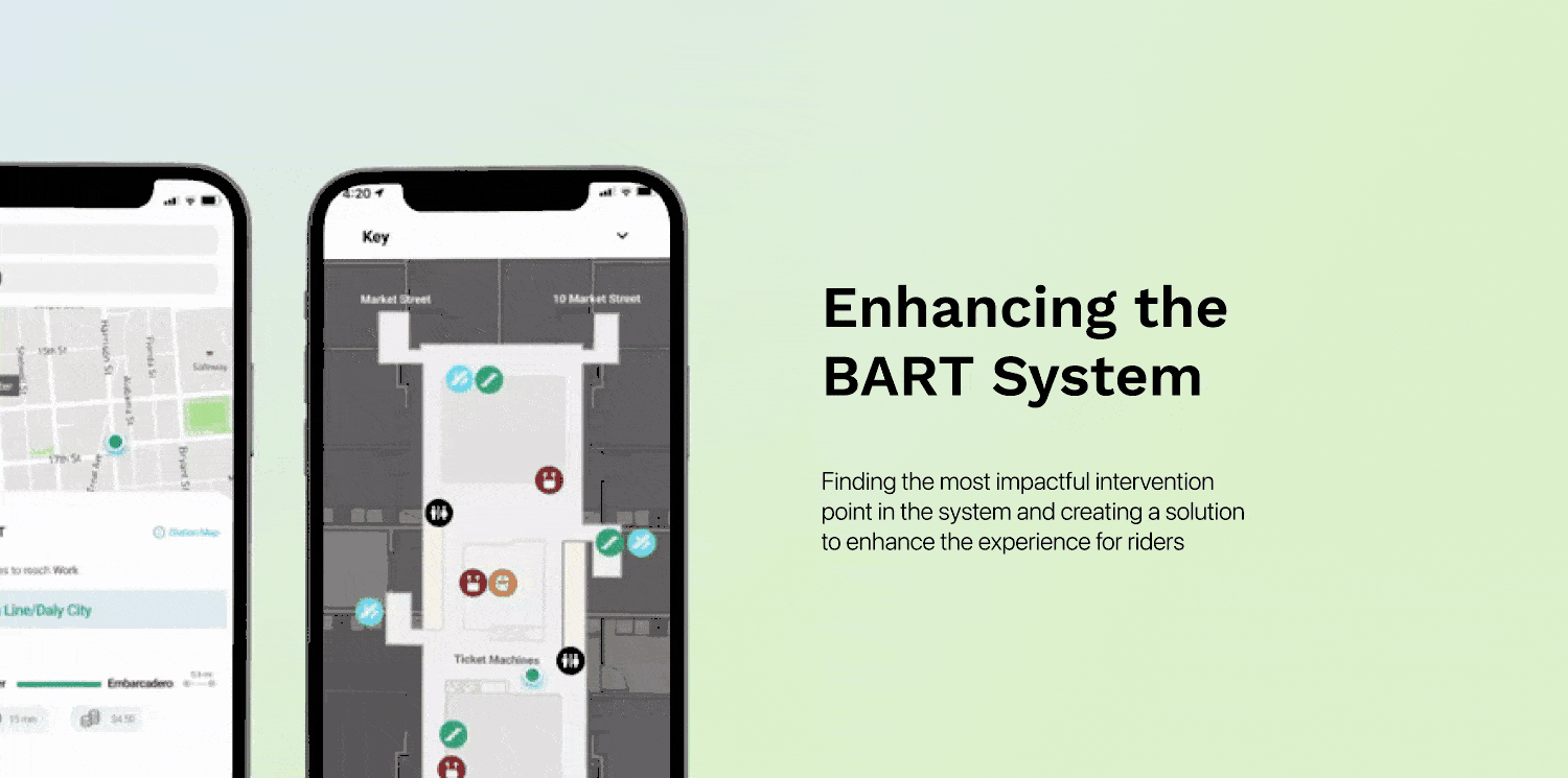
In-station AR directions for people who are not able to locate certain things.
⏭ Next Steps
-
Usability testing the app changes.
-
Make the designs higher fidelity and incorporate BART's design guidelines.
-
Explore how to create awareness of the BART app. In order for the pain points to be solved through the app, and for the app to be useful, people need to know that the app exists.
💭 Takeaways
-
Sometimes the best ideas can come by not having any preconceived biases and constraints. Thinking wrong and unconventionally can ignite creative solutions.
-
Mapping out a huge system and looking at pain points across the breadth of the system, and then prioritizing these opportunities and pain points to arrive at a problem space.
-
There is no set way to approach a problem. It is important to take steps according to what makes sense at the moment, and it might take going back and forth multiple times in order to figure out how to proceed.